


One To Watch: The Guy She Was Interested in Wasn't a Guy at All
Let's get green.

Before I even talk about this series, I need to establish how unlikely I was to like it, or to pick it up at all. I essentially never read slice-of-life without something akin to Buddha and Jesus on holiday (Saint Young Men), prehistoric characters (Dinosaur Sanctuary), or former yakuza (The Fable, Way of the Househusband).
All of those things were traded out for what essentially amounts to a YA rom-com. Again, not usually my thing, in manga or otherwise.
But this book was literally placed into my hands, and as soon as I opened it, two things leapt out at me.
1) The green accent work. Rather than just black and white, as manga traditionally is, it is practically bursting with a lime green that is so vibrant and well placed that it becomes its own little masterwork of originality. Take a look:
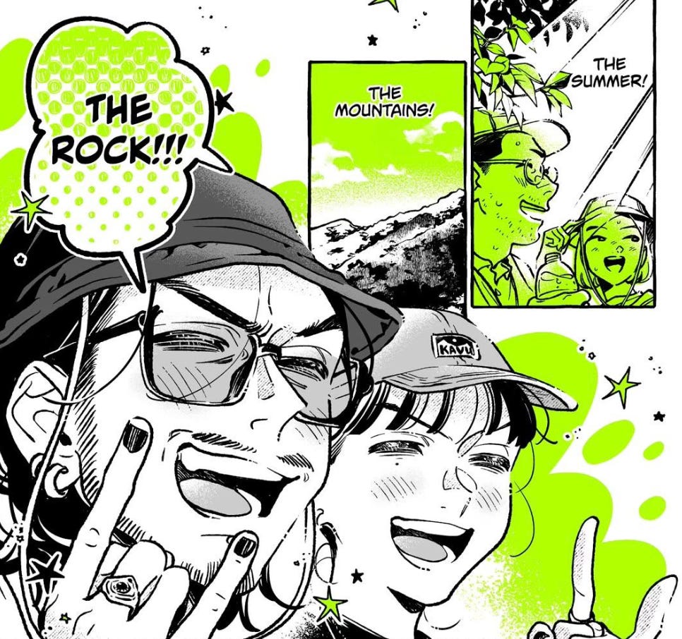
It’s genuinely beautiful, it’s never intrusive and it’s wielded with such effectiveness. Almost like the red in Sin City, but not as obvious. It’s a cut above when it comes to artistic design.
2) Panel interplay. I pointed this out in Tougen Anki (also from Yen Press), but in my humble opinion, a story’s layout should reflect the story itself. If you have rigid panels and untarnished white space in between, it should reflect the nature of the story. Start getting into more fluidity in panel separation and action between borders and you up the pacing of the story.
The Guy She Was Interested in Wasn't a Guy at All is the latter.
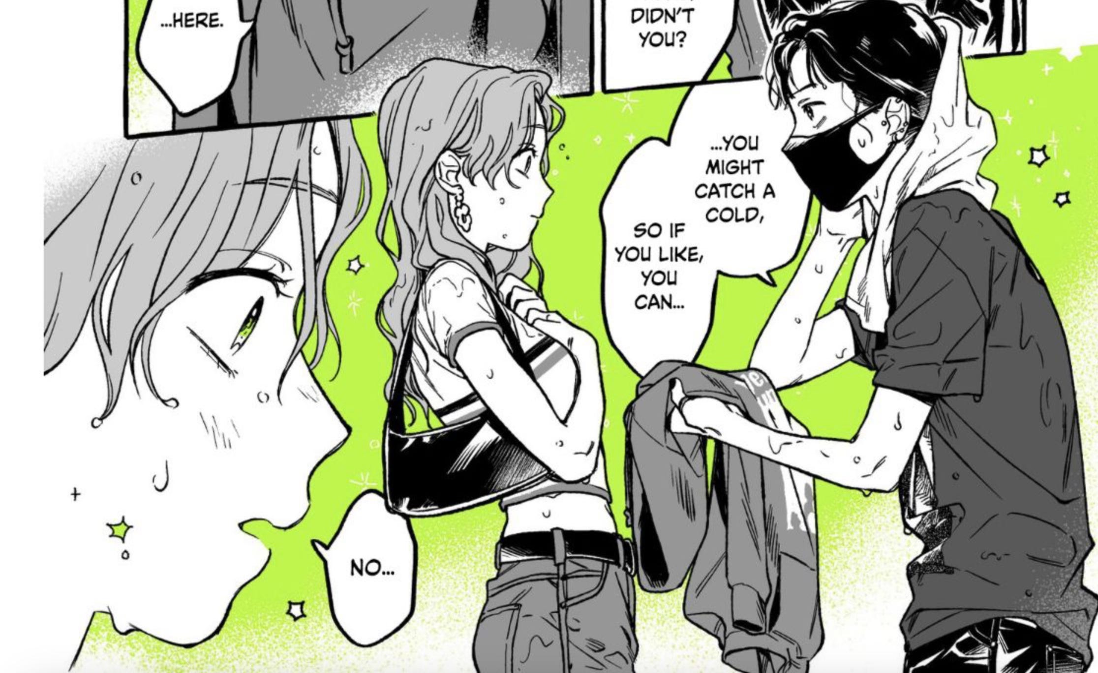
There is so much action and emotion on every single page, largely thanks to how fluid the layouts are. And it’s never confusing to read either. It’s almost like stream-of-consciousness, but so well organized, despite the breaking of borders. It makes for such an energizing read that was over far too soon.
And that’s just what got me into the book. What kept me in, in addition to those two things, were two more things.
1) The sharpness of the dialogue. Again, to reference point #2 above, when setting an energetic pace, there are a lot of factors that have to contribute, and one such factor is smooth and quippy dialogue that readers can digest quickly, but still fill them up. The dialogue is so snappy, it moves with a torrid pace, but it also knows when to slow down and linger in the moment. Essentially, it sets its own tempo.
Mix that with humor, both from situational comedy and from side characters like Toga’s uncle (love him), and there’s just so much to keep you living on the page.
2) Authenticity! Funny I just wrote about this with Blue Period last week. I saw the exact same here, except with music instead of art. There are frequent references to Foo Fighters, Nirvana, etc. in places where it would have been just as easy to reference nondescript, nameless or made-up bands.
Rather, by immediately naming the bands, engaging in that grunge rock scene, we are effectively connected with what we, the reader, bring to that same scene. Or, you can learn some about it along the way. Conveniently, I too am a fan of grunge, so right away, I could hear the soundtrack of this story. Which makes a huge difference in elevating the story to a different plain.
Last but not least, and it’s highly likely this will become a bigger post too, but I love when a story has secrets that are being withheld from one or more involved parties. Toga and Osawa are the two main characters. Toga works at her uncle’s record store, Osawa is a preppy classmate who crushes on Toga, thinking she’s a guy (Toga wears a mask when she’s working). Toga knows who Osawa is. Osawa doesn’t know who Toga is. That’s a secret that, as readers, we know. But Osawa doesn’t. That’s both a fun and difficult place to be as a storyteller because you have the responsibility to know when the secret has to be revealed to best serve the story.
That secret was fully revealed about halfway through volume one. I didn’t expect it to be so soon, but it served the story so well because, realistically, it couldn’t be drawn out much longer. Plus, in terms of character, it was a big step in moving the plot forward and likely couldn’t have been achieved in any other way.
I’m really excited about this one. It looks gorgeous, it reads so well and it practically buzzes. Plus, Yen has a knack for book packaging. Look at this one, look at The Summer Hikaru Died. Simple, gorgeous book design with singular, expressive colors.
It comes out October 22nd, and you should have this on your radar, no matter what your usual reading tastes are.
Huh that's really neat. I've never seen a manga use green like that. It's an interesting choice but from the pages you shared it looks like it really paid off.